Designing Trust: Practical Guidelines for Nonprofit Websites
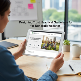
A nonprofit’s website is often the first place people encounter your mission, values, and impact. That first impression needs to be clear, confident, and compelling. Begin by clarifying your mission in a concise headline and a short supporting statement that appears immediately on the homepage; visitors should understand who you are and what you do within seconds. Follow that with a simple, well-organized navigation that reflects priorities—programs, impact, how to help, news, and contact—so users can find what they need without guessing. Prioritize user-centered responsive design: assume visitors will arrive on phones, tablets, and desktops and design interfaces that adapt seamlessly. A responsive layout paired with mobile-first thinking reduces frustration and increases engagement, while user testing with real constituents helps uncover confusing language, hidden features, or broken flows. Clear language, short paragraphs, and purposeful headings all contribute to accessibility of information and reinforce that your organization respects people’s time and attention.
Strong visuals and intentional layout carry the emotion and credibility of your work, but they must be balanced with performance and accessibility. Use high-quality photos and short videos to show beneficiaries, volunteers, and outcomes—authentic imagery builds empathy faster than abstract graphics. However, optimize media for fast page loads: compress images, use appropriate formats, and implement lazy loading to keep pages responsive. Include transcripts and descriptive alt text to meet web accessibility standards and to ensure screen-reader users receive the same story. Consistent visual hierarchy—easy-to-scan headings, readable fonts, and contrasting colors for important elements—guides visitors to the actions you want them to take. Don’t overlook site speed and security; a slow or insecure site can erode trust and drop users before they even read your mission. Combining strong visuals with technical diligence preserves both impact and performance.
Clear calls-to-action (CTAs) transform interest into support. Place prominent, action-oriented CTAs on the homepage and throughout program pages—“Donate Now,” “Join a Volunteer Day,” “Subscribe for Updates,” or “Request Help”—and make sure they use active, benefit-focused language. Simplify donation and volunteer flows: a short, secure donation form with suggested amounts, recurring gift options, and one-click payment methods dramatically reduces friction. Offer multiple, easy-to-find ways to get involved—one-off gifts, monthly support, volunteering, event registration, and workplace giving—so visitors can choose the option that fits them. Transparency about finances reinforces willingness to act: publish audited financials, annual reports, and clear explanations of how donations are used. Social proof, such as testimonials, beneficiary stories, and impact metrics, complements transparency; a few authentic quotes or short case studies help prospective donors and volunteers understand the real-world difference their support will make.
Regular, relevant content keeps your site dynamic, improves search discoverability, and nurtures relationships. Maintain a blog or news section with updates about programs, volunteer opportunities, beneficiary progress, and behind-the-scenes perspectives; timely content signals a living organization and provides fresh material to share on social channels. Integrate your website with social media platforms to amplify stories and to let visitors engage on their preferred networks—embed posts sparingly, link to channels prominently, and include easy social sharing for articles and campaign pages. Make contact information highly accessible: a clearly labeled “Contact” page, a short contact form for inquiries, phone numbers, office hours, and a map if relevant. For organizations working across languages or regions, include language switchers and locally relevant contact points. Additionally, incorporate analytics and SEO basics—descriptive page titles, meta descriptions, structured data, and performance monitoring—so you can measure what’s working and refine content and outreach strategies over time.
Finally, view your website as an ongoing relationship-builder rather than a static brochure. Commit to routine maintenance, accessibility audits, and usability testing to ensure the site remains welcoming and functional for diverse audiences. Invest in web accessibility so people with disabilities can navigate, understand, and act—this includes keyboard navigation, sufficient color contrast, semantic HTML, and clear labels for forms. Regularly test donation and volunteer flows, keep financial documents and impact numbers updated, and refresh visuals to reflect current programs and beneficiaries. Train staff or volunteers to manage content updates securely and to respond promptly to inquiries. When nonprofits combine mission clarity, user-centered responsive design, strong visuals, transparent finances, frictionless giving and volunteering paths, social proof, content rhythms, integrated social media, accessible contact, and web accessibility best practices, their websites become powerful tools for trust, engagement, and long-term support. Make the site a trustworthy extension of your organization’s work, and it will reward you with deeper connections and a stronger base of supporters.


